DaileyHyde is an emerging organic apparel company founded by two friends with a passion for fashion and textiles.
The goal of this project was to develop an identity system that can grow alongside the development of the small business, DailyHyde. The company is in its early stages — so there wasn’t much source material to reference. However, the two friends have a strong vision and I worked with them to develop a brand identity that reflects their concept and brings it to life.
100 Word Summary
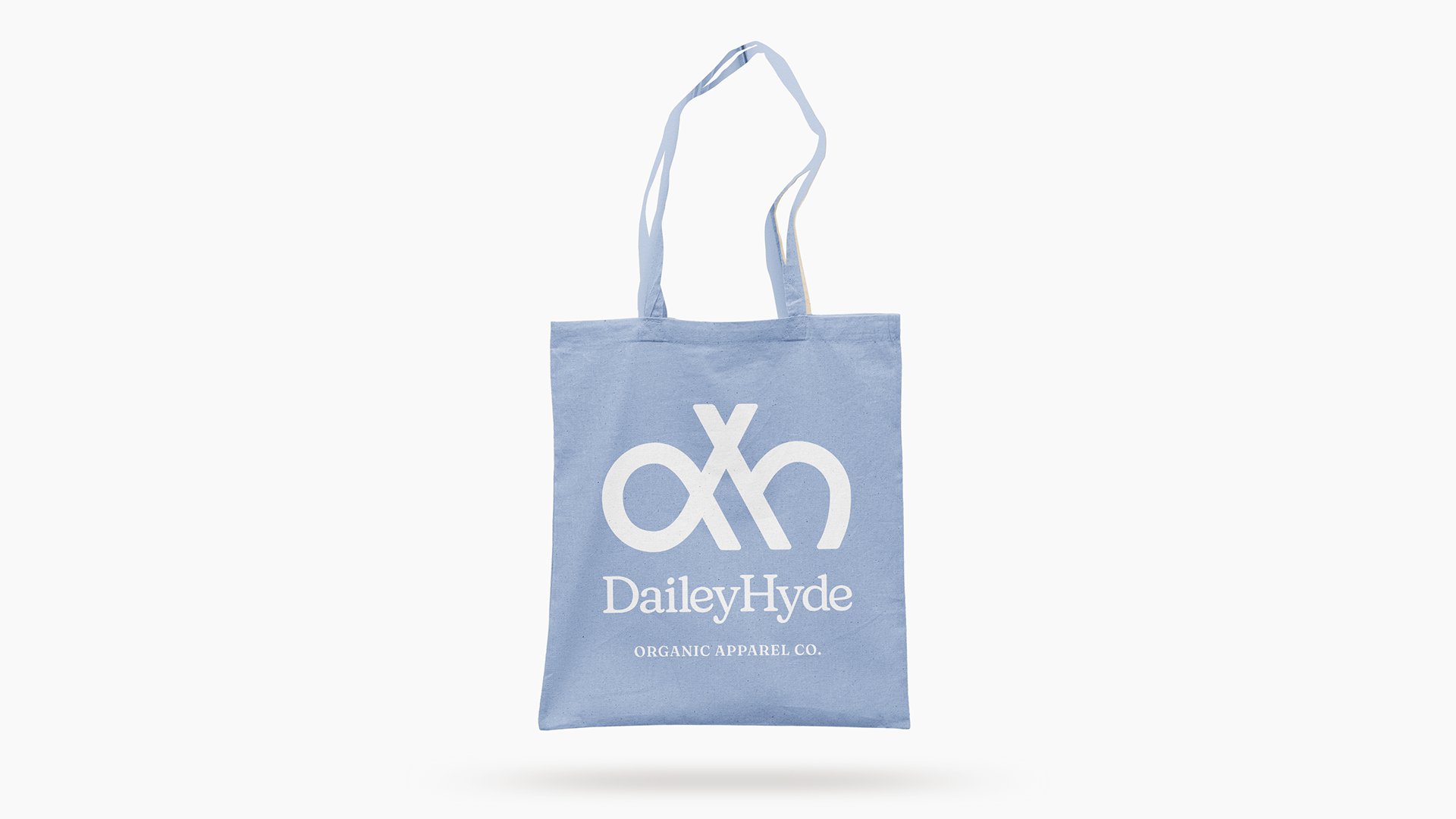
For the logomark, I wanted to keep their names as the primary focus by highlighting a “d” and “h” but avoid developing any hierarchy between the two. I created a symmetrical mark, inspired by a weaving pattern, that combines the letters and the commonly seen “x” when two brands collaborate in the fashion and apparel industry. Finally, I wanted the mark to be bold enough so it could be embroidered on the cuff of a shirt. For the logotype, I manipulated a humanistic serif typeface by exaggerating the curves throughout the letterforms to invoke a very organic and natural feeling.
Year: 2023
Personal Focus Areas:
Branding / Logo Design / Identity Design